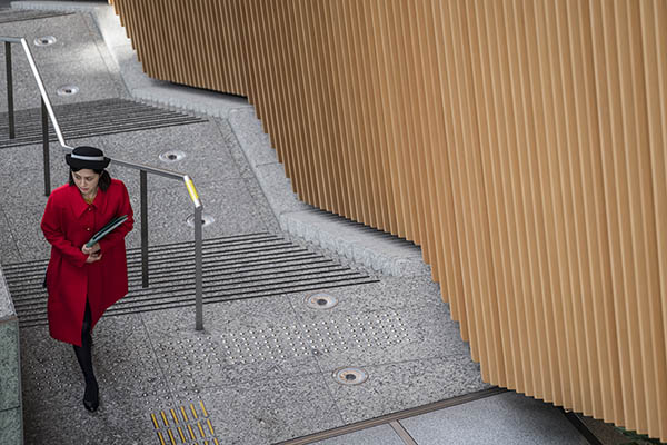
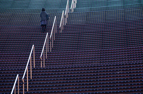
Learning the rules of photo composition seems overwhelming to many photographers, but it doesn’t need to be that way. This tutorial has 12 easy to understand tips to get you composing the way that the pros do. These simple yet powerful guidelines will be a fantastic way to visually express yourself with your camera.
1. Use The Rule Of Thirds
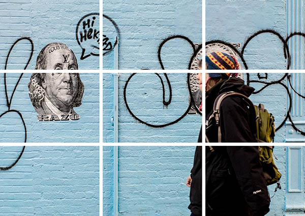
You’ve probably heard of the rule of thirds but maybe don’t know the full extent of the composition rule, or at least need a refresher. The rule of thirds is loosely based on a tic-tac-toe grid that you can imagine overlaying your photograph. This rule works well for people, landscapes, architecture, and nature photography.
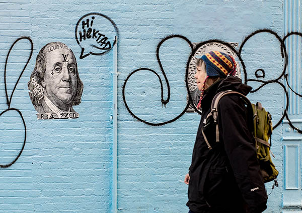
Take a look at this street photo of a woman walking past a graffiti covered wall:
If the rule of thirds is applied to this photo (remember the tic-tac-toe grid), the woman’s face perfectly intersects with the upper-right rule of thirds lines. Use the tic-tac-toe grid for photographing a person within your horizontal or vertical picture.
Remember that it’s the person’s face that should be on either the left or right intersecting points.
Landscape and scenic photographers can also make use of this rule, but aren’t limited to a tic-tac-toe grid. Below is a traditionally composed mountain scene where the sky roughly occupies the top third of the picture, the mountains are in the middle third, and the trees occupy the lower third of the picture space.
By dividing up the photo into three equal horizontal lines you can see how the rule of thirds works great for landscape photography.
Keep in mind that your own landscape photo doesn’t need to exactly follow the three horizontal lines. The lines are simply guides to help you balance your photo into three distinct sections. There’s no need to just limit this compositional rule to mountain scenes either. Almost any landscape photo can benefit from the rule of thirds.
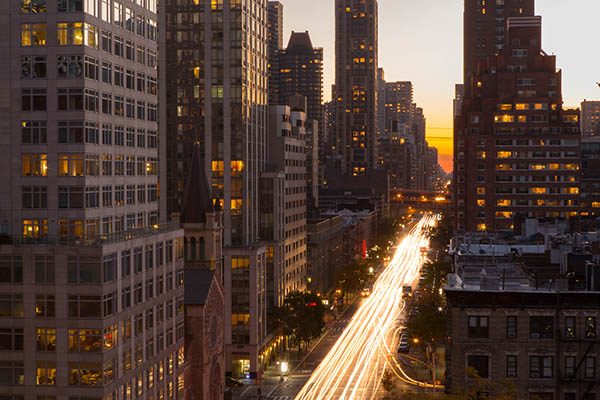
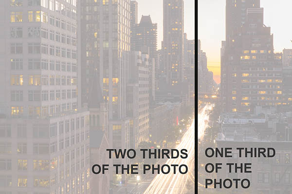
Another interesting aspect of the rule of thirds is that you can break it down into only two sections instead of three. Take a look at this photo of New York City:
When you are composing your photo, imagine a line going through your picture while you are getting your shot ready. Is there a section of the photo that stands out, and can be put to one-third of the picture space? If so, the remaining two-thirds of the picture doesn’t need to be split up.
2. Use Symmetry In Your Photos
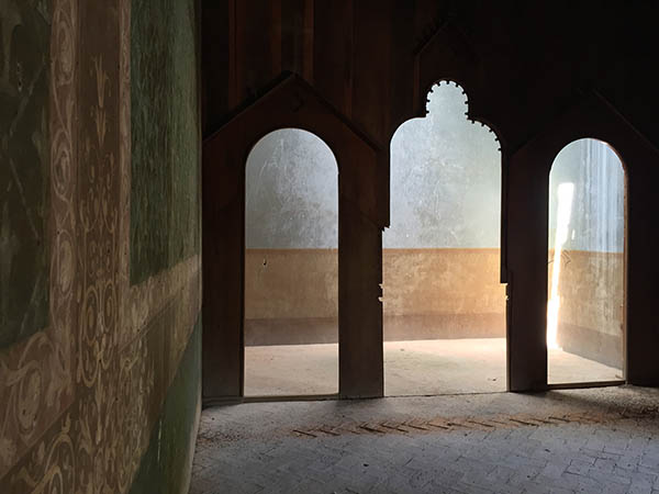
Take a look at the photo below. Do you feel that it’s a well balanced photograph? It obeys the rule of thirds because it has the green wall on the left side, but somehow the picture doesn’t feel right.
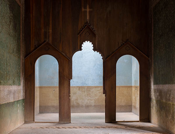
When your subject is symmetrical, meaning that the left side is equal, or almost equal to the right side, its best to compose your photo as straight on as possible. This version below feels much more balanced, and as a result becomes a more effective photograph.
Don’t forget to stand in the middle of the room with your camera pointing straight forward toward your scene. If you aren’t in the middle of the room your photo won’t feel balanced.
3. Compose People Intentionally
When choosing how to pose people there are many excellent composition principles out their, but possibly the two most important are a centered placement and a thirds placement.
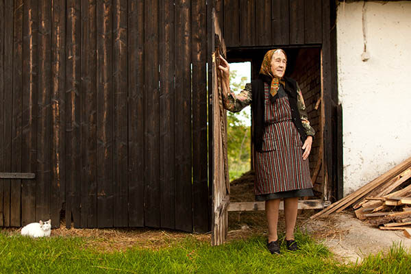
In the following photo the woman is roughly on the right third of the picture. Because she is walking and looking into the picture, we want to allow more space in front of her.
The woman is placed on the right third of the photo so the viewer can imagine her walking past the camera. This photo wouldn’t work as well if she was photographed in the center of the camera frame. When you are photographing people going in a certain direction, allow for more space in front of them than behind them.
You don’t always need to have your subject on the side of the camera frame, as sometimes its better to have them in the middle of the picture. If the person is completely straight on to your camera (their body and face is pointing right at you), you can compose them perfectly centered in your picture.
Most of the time you will want to have the person walk and look into the picture, so you will allow for more space in front of the person. There are however artistic reasons to have a person look in the opposite direction.
If you feel that you would like to convey a sense of melancholy, regret, or reflection, then choose to have your subject look away from the majority of the picture (looking out of the frame).
4. Combine Several Composition Principles Into One
Sometimes everything comes together in your photo and you can combine two or more composition principles in one single image.
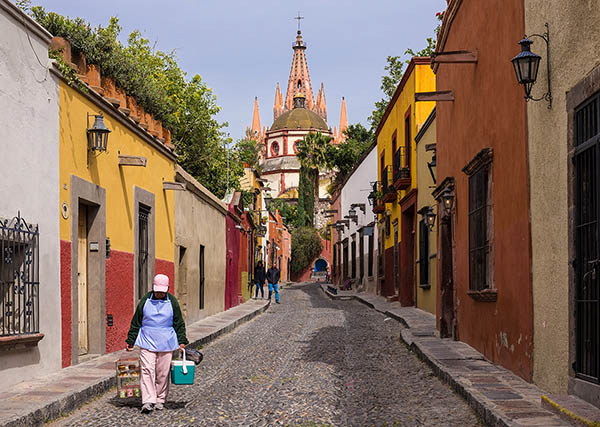
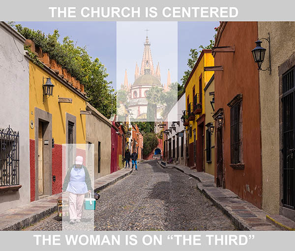
In this photo of a Mexican streetscape there’s a symmetrical church and street, and also a woman walking toward the camera on the left third. This means that the photo uses two different compositional rules in one single photo: symmetry plus the rule of thirds.
If you see a scene that is symmetrical, center your camera (be careful if you are in the middle of the street), and wait for a person to walk along one of the thirds lines.
5. Compose Your Photo Using Color
In this photo of a VW Beetle it’s the bold colors that make up the compositional design of the photo. The VW is considered a block of color, as are the red and yellow color blocks along the wall.
If possible look for colorful scenes that have two, three, or five different color sections.
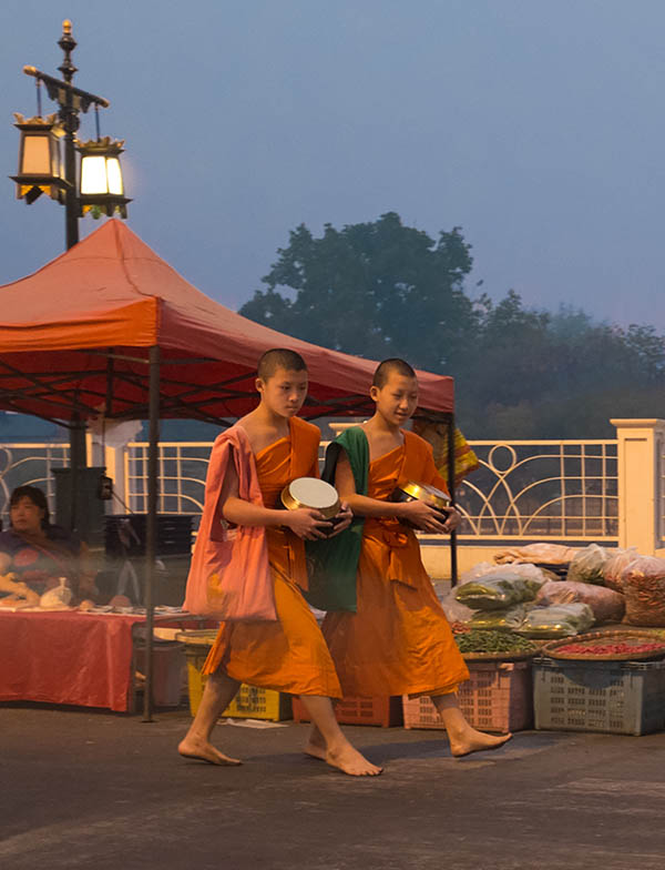
Another way to compose with color is to have your subjects match their background, or at least a background item in the scene. The two similar colors tie the photo together, creating a strong composition.
In the following photo the Thai monks match the tent in the background.
The red scooter matches the woman’s jacket in the photo below of a cyclist in Italy. In both of these example photos, think of the background colors as playing a supportive role to accentuate the main subject.
To practice this technique, find a bright color next time you are in a city, and wait until the right person enters your picture. If you don’t have the time to wait for the right person to walk by, ask a friend to help you out! Remember that bold colors work best.
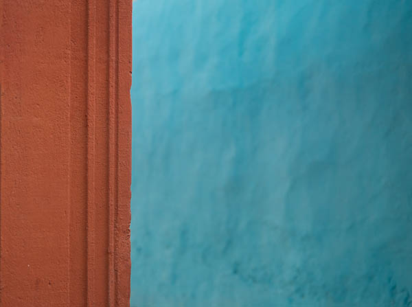
The following photo is a great example of having two composition theories in one shot. The colors create the composition, however the photo also works as a rule of thirds example. The red portion occupies the left third of the picture, and the blue portion occupies the right two-thirds of the picture.
Remember to keep things simple when composing with color. The simpler your photos are the more impactful they’ll become.
6. Create Panoramic Photographs
Most cameras have a panoramic option that allows you to take a wide photo. If your camera doesn’t allow for panoramic photos, you can always take a normal photo and then crop the top and bottom off when editing in your computer.
Because panoramic photos have a unique shape, you may have a hard time finding an above-mentioned composition rule to follow. This is normal for the odd shape of the panoramic: simply take the shot and if you like it, keep it!
7. Create Texture And Pattern Photos
The unique thing about pattern or texture photos is that they never have a main subject matter. To create a texture or pattern photo, make sure that you have hundreds (or thousands) of objects that are visually similar and placed tightly together. These rocks work well for such a photo, as there is no strong individual object that stands out as a main subject.
If you need any more ideas on how to create texture and pattern shots, try a large brick wall, sand at a beach, a field of flowers of the same species and color, or a sky full of rippling or wavy clouds.
The following photo of hundreds of roof tiles works well as a pattern shot, as almost all of the tiles are the same appearance.
Don’t forget to fill the entire frame of your camera with the tiles, rocks, or whatever objects you are using. If the edges of your photo contain objects that are completely different in appearance, your photo will loose its effectiveness.
8. Use High And Low Angles
Did you know that about 90% of all photographs are taken at eye-level? Why not be among the interesting 10% and try high and low angle photography? Your photos will stand out from the crowd simply because you took the time to change your position.
For high angle photos try shooting downward from bridges or windows.
For low angle photos get right down on the sidewalk and capture a perspective that people rarely see.
9. Take Both Horizontal And Vertical Photos
Should you take horizontal or vertical photos? The answer is yes to both! It’s a great idea to take both versions of the same photo for potential magazine covers, or wall art in your house.
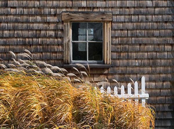
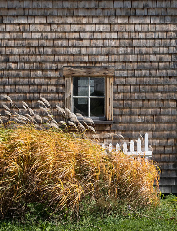
The photo above is a standard horizontal composition that most people would take. The photo below is a vertical composition that allows for a lot of flexibility when it comes to framing for wall art and publishing in traditional or digital media. When possible, try and take two versions of the same scene.
There may be times however that taking both a horizontal and vertical photo doesn’t work. For example, most landscape photos only work as horizontals. Or maybe there’s a situation like the following that works great as a vertical, but because there were trucks parked near the building a horizontal photo would have looked terrible.
To summarize, when your scene works well in either horizontal and vertical compositions, you might as well take both.
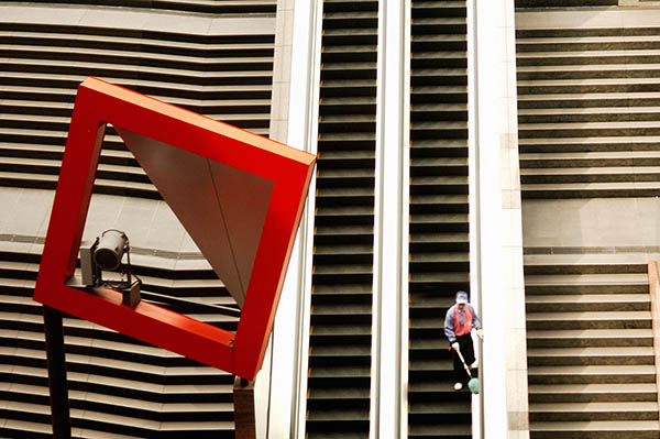
10. Make Use Of Geometry In Your Compositions
Using geometric shapes in your photography is a great habit to get into, as each shape has its own emotional feel to it. Here are some general examples:
10.1 S-Curve
The S-curve is a tried and true method to help your viewer explore your photo. The viewer imagines that they are walking through the street or path that you photographed.
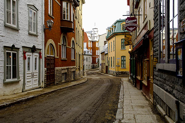
Can you see the winding street S-curve in this photo from Quebec City? Look for S-curves in walking parks and road-ways. The curve can be subtle, or it can be very strong and obvious.
10.2 Triangle
The triangle is a symbol of strength, power, authority, and permanence. If you could put it in human terms, it would be the aggressive business executive heading toward the top of the corporate ladder. Look for triangles when out shooting to give your images a sense of direction.
10.3 Circle
Circles are the opposite of the triangle’s aggressive aspects. The circle is all-inclusive, infinite, and has a sense of the divine. Circles are also very poetic, abstract and rich in metaphors. Include circles in your photos to induce a sense of calm and harmony in your viewer.
10.4 Square
Including a square in your photo creates a sense of either oddness or solidity, depending on how the square is placed in the photo. Squares have a feeling of permanence like the triangle, but they are not as strong or aggressive.
10.5 The Arch
Arches have similar emotional characteristics as circles. Arches are graceful, and have a feeling of authority. The arch has been a symbol of strength and grace since Greco-Roman times. Look for arches both in nature and in human-made environments to give your viewer a sense of calm.
11. Look for Repeating Elements In A Scene
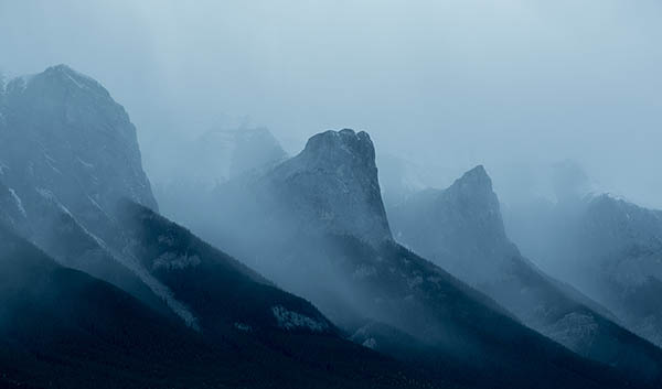
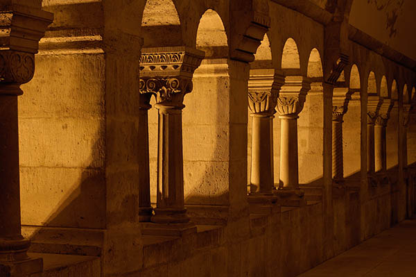
Repeating elements simply means that there is a series of identical or similar objects that recede into the background. This type of composition has the feeling of harmony and depth, and allows your viewer to get a sense of distance when looking at your photo.
In the photo above of the Canadian Rocky Mountains, each mountain has a similar appearance. The mountains are all roughly the same size but look smaller as they recede into the distance. Look for similar scenes in both nature and human-made locations.
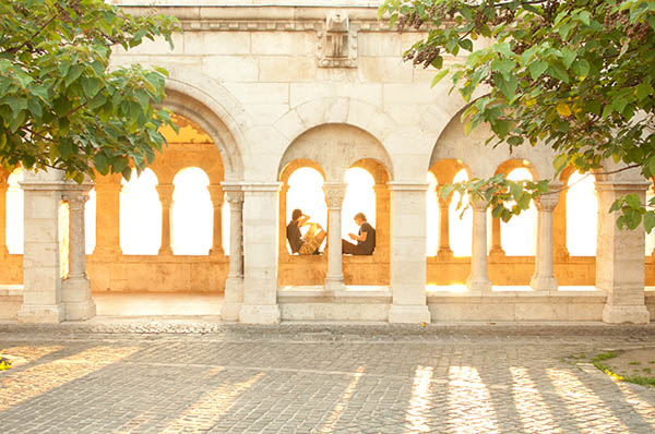
In the photo below of Buda Castle in Budapest, Hungary, each archway is the same size. Similar to the mountain photo above however, the arches appear to get smaller as they recede into the far side of the photo. In your own city look for a series of similar sized doorways to practice this technique.
12. Use Leading Lines In Your Compositions
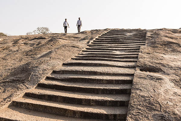
The term leading lines refers to a photo that includes a visual pathway. A visual pathway helps the viewer feel that they can travel through the picture. Think of it as a line that visually leads people through your picture. In Bangalore, India, there is a stairway cut into stone that works perfectly as an example of leading lines:
When you looked at the above photo did your eyes follow the stairway upwards, through the picture? Look for leading lines both in nature and cities. Ask yourself if the pathway that you see in front of your camera will visually lead your viewer through your picture.
The leading line doesn’t always have to be straight. It can sometimes have angles or even curves. Can you see yourself walking down this set of stairs? If so, the photo has a leading line. Look for any lines during your next photo shoot and create a path for your viewer to visually walk up, down, or through.
By following these 12 composition guidelines a whole new world of photographic creativity will open up to you. Instead of just documenting a scene, you will be able to craft the scene, and watch your photography take off to new heights!
You cannot apply all of these composition tips into one single photo, but with regular practice you will be able to instinctively know which rule to follow as soon as you turn on your camera. While it’s true that you can break compositional rules for creative reasons, it is often best to learn the rules first, then break them. Happy composing!

