Do you struggle to take striking and eye-catching photos with your camera? Creating images that command attention is challenging, even for the pros. But one highly effective technique is to include strong graphical design elements in your photos. These include shape, form, line, color, texture, pattern, and text. In this tutorial, you’ll discover 6 ways to use classic design elements to create incredible photos.
What Are Graphical Design Elements?
Graphical design elements are geometric shapes, forms or patterns. They are usually found in man-made objects – such as products, signs, furniture, vehicles, machinery, urban areas, and architecture.
Strong shapes, symmetry, and repeating patterns are a fantastic source of graphical design elements for your photos. And the good news is that these elements are easy to find – they’re all around us.
How Do Graphical Design Elements Improve Your Photos?
When we look at a photo, our brains try to “resolve” or make sense of what we’re seeing. As a photographer, you can choose how easy or hard it is for the viewer to resolve what they see in your photo. You can do this by satisfying the viewer’s need for harmony and balance, or by deliberately creating tension, leaving the scene unresolved.
So, where do graphical design elements fit in, and how can you use them to influence how your photos affect the viewer?
Let’s look at the different types of graphical design elements available to us, and some great examples of each.
1. Lines
Lines are simplest graphical design element we can use – and they’re everywhere we look. One of the most effective ways to use lines is to have them lead the viewer’s eye into the photo, as shown in the photo of the field below. This composition technique is called leading lines.
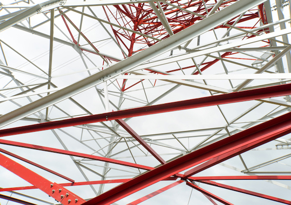
Multiple lines can create fascinating abstract patterns, like the red and white lines making up the power pylon below.
The most boring objects can provide really interesting and powerful graphical design elements which you can include in your photos. The blue corrugated steel cladding found on the side of an industrial building has continuous solid lines as well as broken lines created by the rivets.
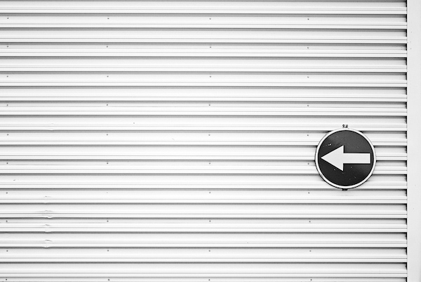
The repeating lines in the photo below are juxtaposed by the black and white arrow sign. The sign breaks the rhythm created by the lines, giving the viewer a definite subject to focus on.
Look for lines wherever you go. Try shooting lines from different angles to see whether they can be used to draw the viewer’s attention something of interest. Also, try getting up close so that the lines fill the frame, eliminating anything distracting.
Leading lines usually extend from the foreground to the background, so it’s important to make sure your choice of aperture gives you a sufficiently large depth of field so that your leading lines are in sharp focus.
2. Shapes
We rely on shapes all day long – it’s how we recognize almost everything we see. So it’s no surprise that when you deliberately include shapes in your photography you’ll create more interesting photos.
Common geometric shapes are easily recognized and often have a meaning that is universally understood. The red emergency triangle below is photogenic in its own right, but by stepping back, or zooming out, the photographer has included some context to the triangle. In this case, the triangle warns of a vehicle breakdown.
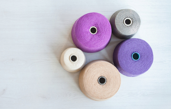
Even household items provide wonderful opportunities for creating compelling photos using graphical design elements. These colorful yarn reels reveal their circular shape best when photographed from above.
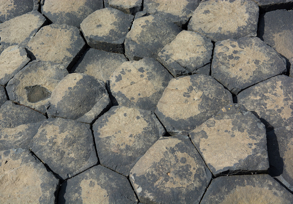
Not all graphical design elements are man-made. These basalt columns are naturally occurring and their repeating hexagonal shapes make a fantastic subject.
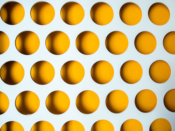
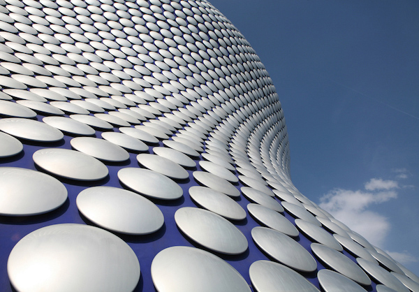
However, graphical design elements in the form of shapes are usually man-made. These repeating circular shapes have been photographed from up close. Because of this, there is no sense of scale or context. Consequently, the photo feels somewhat unresolved – just as the photographer intended.
When looking for shapes, consider whether you want to isolate just one of the shapes, or include many of the shapes so you benefit from the added visual impact of the pattern they create.
3. Form
Shapes can be thought of as being two dimensional, or flat. Forms, on the other hand, are three dimensional – that is to say, they have depth. By including subjects which have depth, we add a sense of depth to the photo.
Generally speaking, form is more dynamic and interesting than mere shapes – because the form still has a shape, but it has depth too. The depth is usually identifiable because of the presence of shadows. Without shadows, the dressmaker’s mannequin below would look two-dimensional and flat.
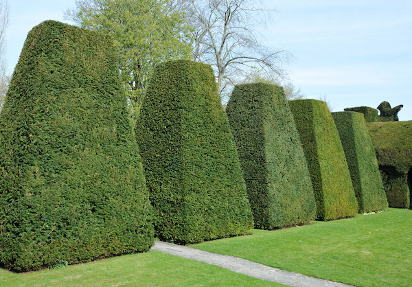
For added impact, look for repeating forms, like these imposing bushes.
Look for form wherever you go. Be prepared to change your position to find the best way to reveal the form’s features. From certain angles, and in a certain light, a form may look more like a simple two-dimensional shape. Once you’ve found a form to photograph, look for repeating forms, for added impact. Because form has depth, ensure your choice of aperture gives you enough depth of field to keep the entire form in focus.
4. Colors
Color is a vital aspect of how we understand our world. So, by deliberately incorporating color into your photos, you can provoke strong reactions in your viewers.
In the example below, a calm, balanced result has been achieved by photographing the man against a background whose color closely matches the color of his shirt.
Compare that to the effect we’ve achieved by photographing him against a contrasting color. Despite having a similar composition to the photo above, the red background changes everything. It’s still a visually appealing photo, but it’s no longer calming and relaxed – it feels like something’s about to happen – and, because we don’t know where is, or what he’s smiling about, there’s an element of tension and potential.
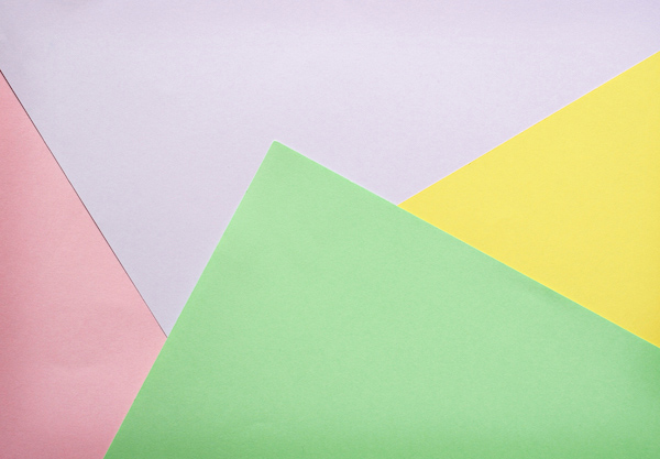
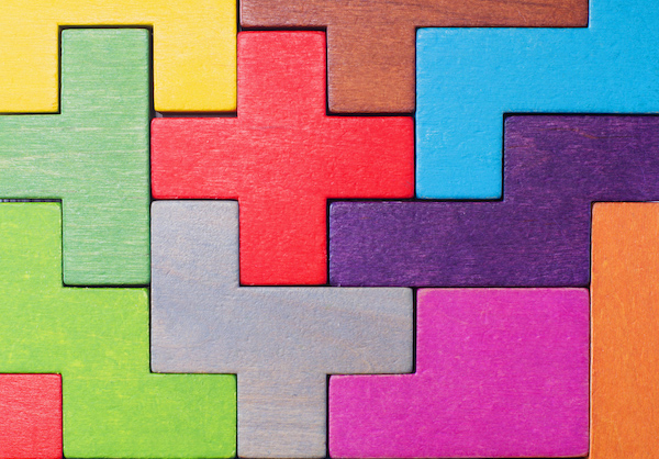
You could try arranging and photographing colored paper on a flat surface. Not only will you discover which combinations of colors work well, but you’ll be able to create geometric shapes and see how they work together.
To get the best out of colors in your photos, you’re going to need to become a little obsessed with color, but don’t worry – it’s a fun obsession to have!
Look for opportunities to photograph different colors together, even when you’re not actively taking photographs. Make a mental note of the combinations of colors you see around you – in fashion, design, architecture and nature. Experiment with combining contrasting colors, but also colors that are similar.
5. Textures & Patterns
Some of the most rewarding types of graphical design elements to photograph are textures and patterns.
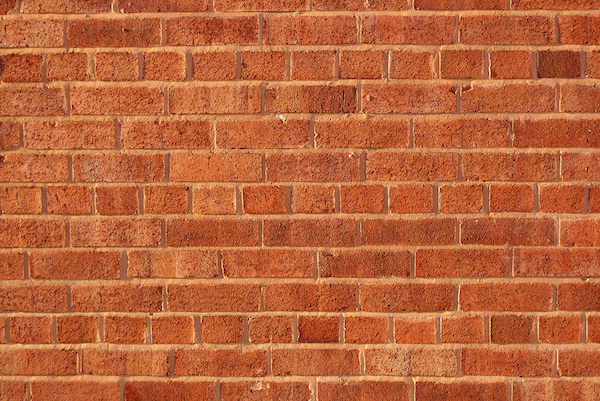
At first glance, the bricks in the photo below seem to be arranged randomly. It’s natural for the viewer to try to find order in this chaos. Once the viewer realizes that the wall is made up of a repeating pattern consisting of one row of short bricks, followed by three rows of long bricks, the photo resolves and the viewer can relax!
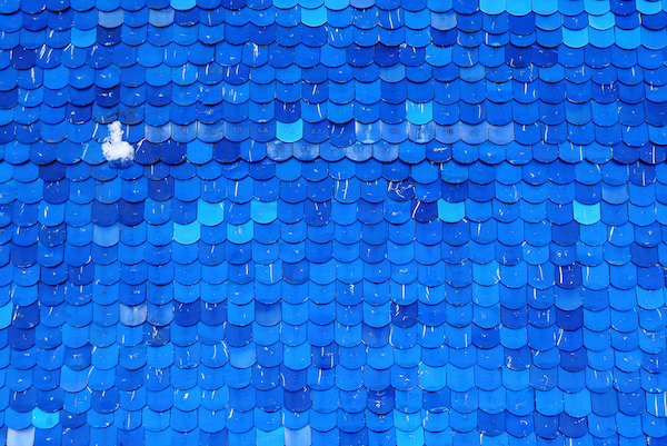
The beautiful blue tiles in the photo below create a wonderful pattern. The imperfect alignment and slight variation in color will appeal to some viewers, but not to others. The tight crop, eliminating any context, means we can only guess how large the tiles are, or what purpose they serve.
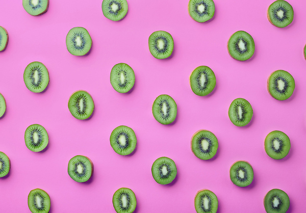
If you’re struggling to find patterns to shoot, why not create some yourself? The photo below was created by slicing up several kiwi fruit and arranging them evenly on a sheet of colorful paper. Shooting from directly above has maximized the impact of this D.I.Y. pattern.
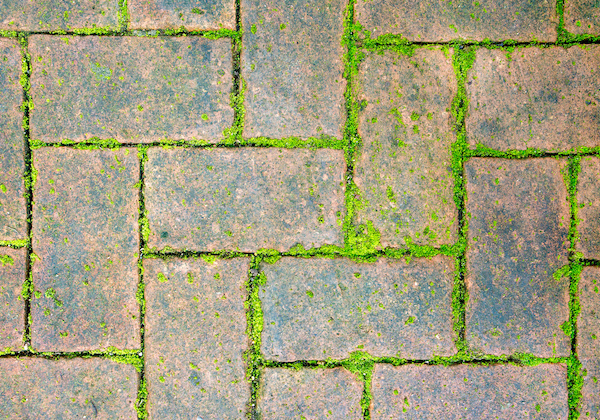
Look for opportunities to combine pattern and texture in the same photo. The brick paving below has become weathered and worn over time. The moss has grown through the cracks in-between. Both the brick surface and the moss have texture – you can almost feel it if you allow yourself to imagine touching it. Also, the bricks themselves are arranged in a regular pattern – so we have successfully combined pattern and texture.
If the texture or pattern is on a flat surface, shoot it with your camera exactly perpendicular to the surface. This will give you the best chance of having the entire surface in sharp focus.
6. Text
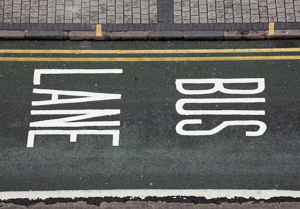
Whether it’s advertising, street signs, house numbers or boat names, text has a powerful effect on us. If we understand the text in a photo, and its context, we can easily draw meaning from the photo. If we don’t understand it, we’re left guessing, and the photo feels unresolved and more mysterious. Both outcomes are perfectly ok, but they depend very much on the viewer, and their understanding of the words you choose to include in your photos.
The photo below includes the word “DIESEL”, sandwiched neatly between another graphical design element we’ve already covered – lines. They serve to emphasize the word by underlining it.
Roads and streets are great places to look for text, and the words can often be quite profound – “Stop!” or “Look Right!”
The photo below combines several of the elements we’ve covered in this article: lines, patterns, and text.
Shop signs are designed for maximum impact and are often a great source of text for your graphical design photos. The neon sign below incorporates eye-catching colors, concentric circles (shapes) and the all-important text – “OPEN”.
When photographing illuminated signs like this, take care not to over-expose the scene. Cameras will often be tricked into over-exposing the scene because the majority of the scene is very dark. Therefore, use your camera’s exposure compensation – adjusting it to -1 or -2 – to get a better exposure.
Conclusion
In this article, you’ve discovered several graphical design elements you can incorporate into your photography. These include lines, shapes, textures and patterns, colors and text.
You’ve also learned how to use these graphical design elements for maximum impact. Remember to practice looking for these visually appealing elements wherever you go, even when you’re not actively taking photos.
Experiment with shooting from different directions to see which angle or perspective shows the elements at their best. Decide whether isolating a single graphical design element works, or whether including multiple elements has more impact.
Think about what to include and exclude from the scene. Frame your shot to include anything that will add context, and to exclude anything that doesn’t. Consider moving closer to the elements you’re shooting so they fill the frame, as this simplifies the scene by leaving out any distractions.
Finally, don’t be afraid to experiment, keep practicing and remember to look for graphic design elements wherever you go!

